Module · CMMS
Interventions Chart
Interventions Chart
The visual intervention analysis functionality provides a clear and detailed perspective of maintenance activities through dynamic graphs. Designed to simplify the interpretation of data, this option allows users to explore the interventions carried out on their fleet by filtering by year and vehicle, ensuring a targeted and relevant view.
Thanks to intuitive filtering tools, it is possible to quickly identify periods of high maintenance activity or detect vehicles requiring special attention. Graphs visualize intervention volumes and frequencies, providing a better understanding of trends and operational needs.
This visual approach helps optimize decision-making by highlighting maintenance priorities. For example, managers can anticipate resource needs, allocate budgets more efficiently or even plan preventive interventions to reduce unforeseen outages.
By centralizing this information in a clear and accessible visual form, the analysis of interventions becomes a strategic tool. It helps strengthen operational performance while ensuring proactive and informed management of maintenance activities.
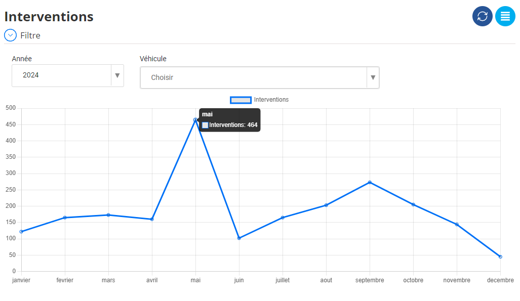
A graphical view for optimized management
This graph represents the monthly evolution of the number of interventions carried out during the year. Its aim is to provide an overview of variations in activity throughout the year, allowing a visual analysis of the most active periods and those where activity is less intense. The data is laid out clearly, with the months aligned on the horizontal axis and the number of interventions on the vertical axis. The blue curve connects the monthly points to make it easier to identify trends.
Analysis of this graph highlights marked fluctuations from one month to the next. These variations can be linked to different factors such as specific operational needs, seasonal events, or changes in demand for services. By observing the curve, it is possible to distinguish periods of high activity where the number of interventions reaches peaks, as well as periods of low activity marked by troughs. These changes may reveal recurring trends or anomalies specific to certain periods.
This type of analysis is essential for resource management and operations planning. Periods of low activity, for example, can be used for secondary activities such as maintenance or training, while periods of high intensity require increased mobilization of teams and resources. By identifying periods of gradual recovery after a trough, it is also possible to plan in advance for the increase in load and prepare for it proactively.
Finally, this chart provides a solid foundation for performance analysis and strategic optimization. It makes it possible to understand how interventions are distributed over the year, to identify factors that can influence these variations, and to improve overall responsiveness to changing needs. By integrating this information into operations management, teams can better respond to fluctuations while optimizing the use of resources.