Module · HR
Graphe Absences
Graphe Absences
Ce graphique offre une représentation visuelle claire et intuitive des absences au sein de l’organisation, mettant en lumière les tendances et les schémas récurrents. Il illustre l’évolution des absences selon divers paramètres, permettant d’avoir une vue d’ensemble sur la répartition des périodes d’indisponibilité.
Grâce à cet outil visuel, les gestionnaires peuvent repérer rapidement les périodes marquées par une forte concentration d’absences et identifier des profils ou des groupes de collaborateurs présentant des absences fréquentes. Cette représentation facilite la compréhension des dynamiques globales liées aux absences, tout en offrant un support pour évaluer les impacts sur les ressources humaines et l’organisation des équipes.
En synthétisant les données sous forme de graphique, cette analyse visuelle devient un levier stratégique pour anticiper les besoins, ajuster les plannings et mettre en œuvre des politiques adaptées, favorisant ainsi une gestion proactive et équilibrée des effectifs.
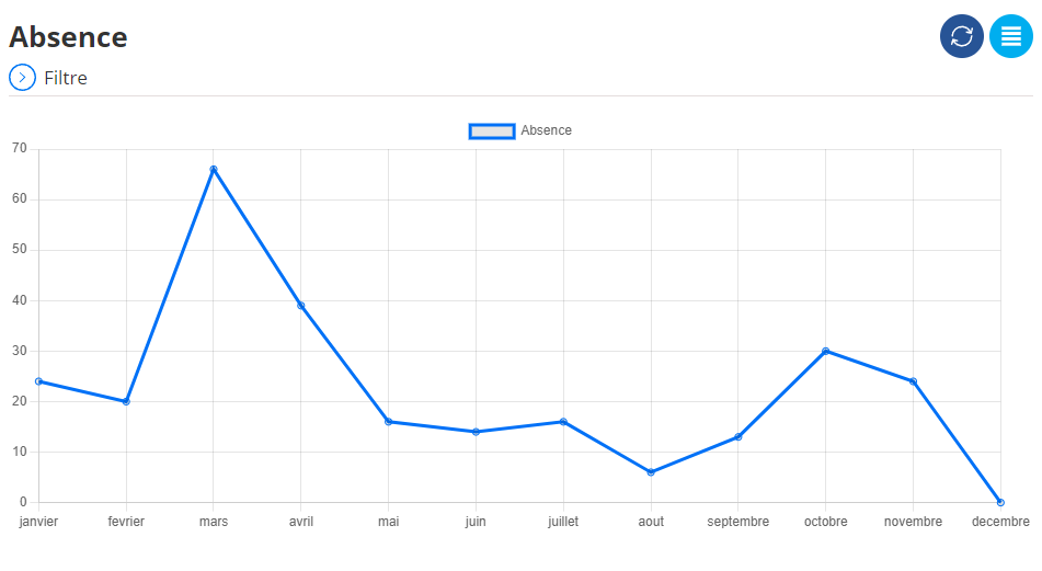
Graphique des absences
Ce graphique illustre l'évolution mensuelle des absences sur une année complète, permettant de visualiser facilement les fluctuations et les tendances. Il se présente sous forme de courbe bleue, où chaque point correspond au nombre d'absences enregistré pour un mois donné.
Ce graphique constitue un outil précieux pour les responsables, leur permettant d’identifier les périodes les plus impactées par les absences et d’ajuster les ressources en conséquence. Les tendances saisonnières visibles aident à mieux planifier les équipes, à anticiper les besoins, et à garantir une organisation fluide des activités de l’entreprise.